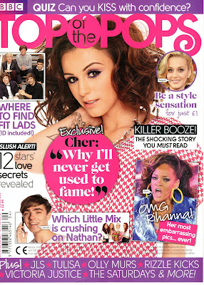
Textual Analysis of a Music Magazine 'TOP OF THE POPS'
The title of this music magazine 'Top of the Pops' is right at the top of the cover page in large, bright pink font so the reader can see immediately the magazine brand when browsing for magazines to buy. the title straight away sends a clear message to the readers about the genre of music the magazine includes. The main colour scheme of the magazine is pink and purple, the bright pink could be seen to represent the fun girliness of the magazine therefore clearly shows that it is aimed at young girls. The main large image of the artist is set in the centre of the magazine and takes up most of the page so the reader is directly attracted to it. The artist on the cover is standing with on arm down by her side and the other arm up by her face which looks like she is inviting the reader to come and read the magazine and her facial expression is directly looking at the reader (Direct Address). The artist is wearing pink clothes with white hearts which links directly into the girly, pink colour scheme of this magazine. Words on the cover such as 'EXCLUSIVE' make the magazine seem special and unique to the magazine market and by having exclusive interview with an artist like Cher Lloyd for example adds to this. Words such as 'SHOCKNG' make the reader more interested to but the magazine and find out what and why is shocking. The use of rhetorical questions are used to help to engage the readers intentions and make them purchase and read it to find out the answers to the questions. The quote 'Why I'll never get used to fame' is next to the main image of the artist to show the article is about her, the reader then becomes interested and therefore they want to read the magazine more. The examples of specific artists which are shown at the bottom of the cover page is for the reader so they can see if their favourite artist is included in the magazine, making the reader want to buy it to read about them. Finally, the bar code, price and issue number is located at the bottom left of the bottom page because it is the least important item on the page however not only is it a legal requirement but is also a typical code and convention of magazines.
