This will be my last post, I have finished my media product and therefore closing this blog!!!!
Thank you and goodbye!!!!
Friday, 18 April 2014
Evaluation!
1) In what ways does your media product use, develop or challenge forms and conventions of real media products?
2) How does your media product represent particular social groups?
4)
5)
7) Looking back at your preliminary task, what do you feel you have learnt in the progression from it to the full product?
2) How does your media product represent particular social groups?
In my media product, I have shown a representation of young, female teenagers, who are keen fans of pop music. This is because often the target audience for pop music is the same target audience that I am trying to reach, pop music is very popular with this generation, and this helps me to target a wider audience, despite it being mainly aimed at only females.To make sure that I represented my chosen social group I spent a lot of time during the research and planning stage of my coursework looking at real media texts. In doing this I was able to identify what are the typical codes and conventions and I also learnt the various techniques in which they used to represent particular social groups.


I represented this particular social group by the colour scheme I have chosen. To keep my pages from looking too cluttered and busy I used mainly pink throughout as base colour as it is girly and keeps in with the theme of my magazine. I used different shades of pink with hints of yellow, white and purple – all girly colours, to keep the look of my pages consistent. I have used five primarily sourced photographs throughout my pages; the majority of these are of ‘Emily Pope’ as she is the celebrity endorsement and the exclusive interview of this issue. I have only used images of females as my target audience is aimed at young females and they look up to these women in the media as role models and aspire to be just like them. The language which I have used is very colloquial in style, this is intentional as it is the language which is familiar to the target audience making it more accessible for them. My magazine Chart Poppers! Could been seen to a certain extent as stereotypical nevertheless it represents them positively. This can be seen because shows their innocence and appeals to them with the girly themes which shows their youth and innocence. This magazine is accessible to all, despite the target audience and ethnicity doesn’t matter as there is no indication of any race or religion in particular, so any female teenager is able to enjoy it.
3) I represented this particular social group by the colour scheme I have chosen. To keep my pages from looking too cluttered and busy I used mainly pink throughout as base colour as it is girly and keeps in with the theme of my magazine. I used different shades of pink with hints of yellow, white and purple – all girly colours, to keep the look of my pages consistent. I have used five primarily sourced photographs throughout my pages; the majority of these are of ‘Emily Pope’ as she is the celebrity endorsement and the exclusive interview of this issue. I have only used images of females as my target audience is aimed at young females and they look up to these women in the media as role models and aspire to be just like them. The language which I have used is very colloquial in style, this is intentional as it is the language which is familiar to the target audience making it more accessible for them. My magazine Chart Poppers! Could been seen to a certain extent as stereotypical nevertheless it represents them positively. This can be seen because shows their innocence and appeals to them with the girly themes which shows their youth and innocence. This magazine is accessible to all, despite the target audience and ethnicity doesn’t matter as there is no indication of any race or religion in particular, so any female teenager is able to enjoy it.
4)
5)
To make my magazine as appealing as possible to my target audience I had to focus on various aspects which my target audience would be attracted to. First of all I had to identify who my target audience was, my magazine is targeted a female teens aged between 12-13 who love pop music,this I had previously outlined in my treatment sheet. A lot of the readers are at the age where they are likely to be getting pocket money from their parents so with this money they can afford to purchase the magazine as it isn’t too expensive. Also a lot of the parents are in the C1/C2 socioeconomic grouping so with the aim to give it an affordable price the families on the low economic groupings are able to enjoy it too. Some of the readers will be aspiring to be like the celebrities featured in the magazine and will of course look up to them. This explains why the pictures of Emily Pope reflect youth and a refreshing attitude, setting a good example to the young readers. Many of the readers are young so therefore they will be able to appreciate media content which isn’t too challenging a lot better as it familiar to them. A main part of a young girl’s life is keeping up with the attest fashion trends and staying up to date on the latest gadgets and media products so having these as features in Chart Poppers! Will help them address these topics. Of course, they will also have a keen interest in music and all the areas surrounding music. Many young girls dream of being a ‘pop princess’ when they grow up so they will look up to Emily Pope as an X Factor winner as a role model and something to aspire to, as they went from living regular lives like them to a life of fame and fortune. Chart Poppers! Readers are typically teenaged girls, who are confident with big dreams of future success, Chart Poppers! Helps its readers realise that their dreams are achievable and also help them by giving advice on how to achieve their dreams and fulfill their life long goals.
6)
6)
7) Looking back at your preliminary task, what do you feel you have learnt in the progression from it to the full product?
Overall, I think that I have in fact improved since the
preliminary task where I made my student magazine; this can be seen through the
difference in quality displayed in the two pieces of work.


After deciding to resubmit my coursework I re-did my pages. After an additional year of improving my media skills I was able to improve the overall look of my pages and hopefully succeed in making my work look more professional. After having to change my initial designs of my pages during post-production last year because the pictures didn't come out the way I hoped for I knew what to avoid this time round and payed special attention to my photos and having multiple photoshoots in order to make sure I have enough of a variety in case anything unexpected happened when I tried to edit the,m during post production. I really tried to make Chart Poppers! Appeal to my target audience and I spent a lot of time pre-planning my work i.e. different fonts, colour schemes and layouts. With the help from those who gave me immense amount of feedback I managed to make the best music magazine possible. I’ve developed more practical skills and a better understanding of the different technologies and software’s, which hopefully will be usable in the future. Through this process and my research surrounding the final product I have gained a wider knowledge and understanding of the magazine and music industry. I believe that through this process I have been challenged with my practical skills, research skills and creativity. I have enjoyed learning new skills and faced the challenges with a lot of determination to succeed. I have also gained a respect for those who do produce and distribute magazines as it’s not an easy task but I have enjoyed this process and I am proud of what I have produced.


After deciding to resubmit my coursework I re-did my pages. After an additional year of improving my media skills I was able to improve the overall look of my pages and hopefully succeed in making my work look more professional. After having to change my initial designs of my pages during post-production last year because the pictures didn't come out the way I hoped for I knew what to avoid this time round and payed special attention to my photos and having multiple photoshoots in order to make sure I have enough of a variety in case anything unexpected happened when I tried to edit the,m during post production. I really tried to make Chart Poppers! Appeal to my target audience and I spent a lot of time pre-planning my work i.e. different fonts, colour schemes and layouts. With the help from those who gave me immense amount of feedback I managed to make the best music magazine possible. I’ve developed more practical skills and a better understanding of the different technologies and software’s, which hopefully will be usable in the future. Through this process and my research surrounding the final product I have gained a wider knowledge and understanding of the magazine and music industry. I believe that through this process I have been challenged with my practical skills, research skills and creativity. I have enjoyed learning new skills and faced the challenges with a lot of determination to succeed. I have also gained a respect for those who do produce and distribute magazines as it’s not an easy task but I have enjoyed this process and I am proud of what I have produced.
Wednesday, 16 April 2014
Audience Feedback!
Audience Feedback!
After I had finished my final drafts on my pages I asked two teenaged girls close to the age of my target audience for feedback, this is what they said:
Sarah: "I really like the front cover, I think it’s
cool because the background is pink which is different to other magazines and
the model on the front is bright and stands out, it would definitely catch my
eye on a store shelf. The layout looks professional, like a well-known magazine
that you see in shops! I like how the contents page is spread out it allows the
writing to be easily readable this makes it easy to find page numbers and
features quickly. However, you could use more images or something to fill out
the space a little bit more. I love the
main picture for the double page spread, her pose makes her approachable, the
top of the page where it says ‘Meet….Emily Pope’ seems to be a bit empty so
that could have a better use of space but overall the pages are not too
cluttered and easy to read, which is good.”
Jenna: "The front cover stands out because there are a
lot of bright colours which grab your attention straight away. The articles
shown on the cover is a quick way to grab readers so it was a good idea to put
these on the cover where people can see it first before opening the magazine. I
also like how these is a smaller picture of the front cover model on the
contents page as well because it keeps consistency from the front cover to the
contents page. I like the double page spread as it the big picture really catch
your eye right away and the quote pulls you into read the rest of the
interview. The text is easy to read and the two colours used help the reader to
know which part is the question and which part is the answer."
Tuesday, 15 April 2014
Audience questionnaire and analysis!
Audience Questionnaire and Analysis!
Here is some of the audience feedback from my questionnaire, here are my results (based on 10 people).


Saturday, 5 April 2014
Re-drafting of my pages!
In my A2 year I decided to redraft my pages and resubmit them here is the changes to pages:


AS pages:
A2 pages:
Friday, 4 April 2014
Another draft of my DPS!
After getting some feedback from my teacher I redrafted my Double Page Spread, here is my updated version!

Thursday, 13 March 2014
Draft number 2 of my cover!

In this draft I have changed the bottom tagline and changed some of the taglines. I will look for some audience feed back as to what I can change to make it better.
Thursday, 6 March 2014
Re-draft of my Double Page Spread!
I have begun to redraft my double page spread again, I have added more text i.e. questions and re-edited the main picture and added pull quotes. It's not quite done yet as I still have to add more to fill it out but here's a start.
I am creating my DPS using Adobe InDesign:

 here is the picture which I have edited using Adobe Photoshop.
I am creating my DPS using Adobe InDesign:
here is the picture which I have edited using Adobe Photoshop.
Another draft of my Cover!
Here is another draft of my Pop Magazine Cover, this could potentially be my final draft! There are a few things which I want to just tweak and depending on whether they look better then I will upload my FINAL DRAFT!

Monday, 17 February 2014
Font research!
I have started work on my cover and started with the fonts which could be possibilities. I am currently using DaFont.com for ideas as to which type of font I want for the design of my Pop Magazine Cover.
By researching the different fonts available I have got an idea of the type of font that I want to use, the font which I envisage for my Cover is to be big and slightly rounded but not to an extent where it looks childish, but at the same time I want to keep with the Pop Genre so it'll need to be fun and girly and catch the audiences eye.
As part of my research for what font to use and what different fonts are possible, I started with the History of Typography as seen in the video below...
From this video, I have learnt a lot about the different types of available and how they came about and what significance they have. It was very useful as part of my research.

.jpg)
Monday, 10 February 2014
Re-drafting of my cover!
I have begun the drafting process of my front cover, I have changed the photo and started to again look at pop magasins for inspirations and to make sure that I have all the genre conventions, here is a preview of my draft process.


Audience feedback on Cover!
Potential Cover Photos
So, since I have decided to redraft my front cover I needed a new cover photo I previously posted my final four options but after asking around for some audience feedback the majority vote for the photo below therefore this will be the photo I will be using for my new cover!

So, since I have decided to redraft my front cover I needed a new cover photo I previously posted my final four options but after asking around for some audience feedback the majority vote for the photo below therefore this will be the photo I will be using for my new cover!
Friday, 7 February 2014
FINAL OPTIONS: for my cover!!!
I have narrowed it down to four final options for my cover but I will ask for audience feedback as to which one I shall use for the cover.


Here is my final selection and I am going to ask my audience which ones they prefer and think are most likely to fulfil the genre conventions of a pop magazine.
Here is my final selection and I am going to ask my audience which ones they prefer and think are most likely to fulfil the genre conventions of a pop magazine.
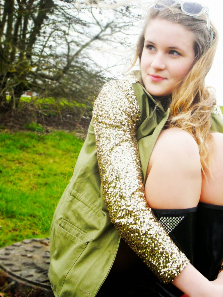
Another Photoshoot!
I had another photoshoot and tried a variety of poses and backgrounds here is a selection of the pictures I took:


 here are some options for my cover but some can also be used for the contents page, I will need to narrow them down to three potential cover images and once I have decided which one I want for my cover I will edit them using Photoshop!
Subscribe to:
Comments (Atom)