Friday, 12 April 2013
3rd Draft of my cover for my music magazine
This is my 3rd and potentially final draft of my music magazine cover! I changed the sticker and moved some of the coverlines. I have tried to keep it in the girly theme and used a pink background to highlight this also to make the model stand out as the white was close with her skin tone as she is quite pale so this way she stands out more and captures the readers attention right from the beginning.
Textual Analysis of a contents page!
Textual Analysis of a Contents Page!
This contents page is from the music magazine Vibe, the
colour scheme for this particular issues contents page is black, grey and blue.
The model used is well known rap artist Kanye West, the image of him is in
black and white to fit in with the rest of the colour scheme. There is a hand
coming over his shoulder which appears to be grabbing his heart which is also
the only part of the image which is in colour.
The tone of the image is cold, this is created by the colours used this
also makes the splash of could in the heart stand out and creates an effect. The
models clothes reflect this theme portrayed by the mise-en-scene. The main
heading which reads ‘Contents’ it laid out in an odd way and is broken onto
three lines. The background shows a big letter ‘V’ in a contrasting colour to
the rest of the page, this appears to be representing the magazines name, ‘Vibe’.
The contents page contains the page numbers and the corresponding article names
on the right side of the page, opposite the model. The text is quite small;
however the sub-headings for the different areas of interest are in slightly
larger text.
Textual Analysis
Textual Analysis of a front cover!
Uncut is a magazine first published in 1997 it is less
mainstream and isn’t as well-known as some of the other music publications. It is
a magazine that focuses on music as well as film and books too. The mast head
remains the same on each issue and the pop of colour adds a brightness which
helps to grab reader’s attention but by keeping the masthead it gives the
magazine a sense of familiarity which the audience will recognize instantly. The white, red and black colour scheme used
for the front cover of this particular issue ties in with the masthead also. Unique
selling points of this particular issue stand out by using bold colours and
different fonts with the celebrities name in the biggest font to catch the eye
and attention of the readers and potential buyers. 'Free CD' is also in a big
sticker badge, this is once again to catch the public’s eye to buy the
magazine. The mise-en-scene has a vintage style and the cover shot using midshot
taken in black and white adding to the vintage look of the cover. The model is also wearing typical clothing to
fit in with the theme of the cover. The stance of the model Tom Waits is quite relaxed,
taken at a low angle using direct address to help portray confidence to the
audience. On the cover there is also a barcode, price, date and issue number
for future reference this also keeps I n with the typical codes and conventions
of magazines and is important as these are some of the things a potential buyer
will look for when thinking about purchasing the magazine.
Textual Analysis
FRONT COVER TEXTUAL ANALYSIS
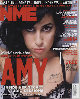
NME is a popular music magazine in the UK, the front cover
of this particular edition is mainly focused on it celebrity model Amy
Winehouse, this suggests that the issue may be highly focused around her as the
picture of her is very large and uses a mid-close up. She uses direct address
to connect with the readers, inviting them in to read. It only says 'AMY'
without her surname anywhere on the front cover implies that the audience will
be familiar with her instantly recognises who she is. The colour scheme is red
and white, with some black from the main image. The colours are complementary
rather than clashing reflecting how this is a more serious issue than usual
magazines. It says 'World exclusive' above the main cover line showing a sort
of exclusivity and this cover line draws the reader in to buy and read the
magazine. The strapline at the top of the page shows some band names such as
Kasabian and The Vaccines this attracts fans of these bands to the magazine. It also makes it easy for readers to find it
without even having to look at the contents by having the page number next to
it. When it says 'have your say' makes it more personal to the readers and makes
them feel involved. The cover lines help to summarise the most important
features in the magazine and they are located near the top down the right side
of the front cover. A lure is used in the cover lines to give the audience an
insight into what it is they could be reading, this hopefully results in the
magazine being purchased. There is also a 'FREE' sticker which is made clear,
letting readers know that they if they buy that issue of the magazine they get
free posters. The date of the issue and price is under the masthead in very
small print. One of the first things usually people like to know is the price
when they look to purchase magazines, so this may be difficult for them to see.
The format of the magazine doesn't seem very formal, this colloquial style
helps to appeal to the target audience
of the magazine- young music fans.
3rd Draft of my Contents Page for my Music Magazine
This is the 3rd and potentially final draft of my contents page for my music magazine.I have made lots of changes throught the construction of this page and used the layout from my school magazine as a starting layout, it made it easier this way and helped me creat the final product.
2nd draft of the Contents Page for my Music Magazine
This is the second draft for my contents page for my music magazine. The layout is simple this makes it easy to reads which is key for the target audience, feel free to leave any comments below for improvements :)
2nd Draft of my Double Page Spread for my Music Magazine
This is the second draft of my music magazine double page spread I edited the main picture and changed the background to make it easier to read the writing, please feel free to leave and comments or suggestions forhow i can improive it :)
Subscribe to:
Posts (Atom)


