Friday 12 April 2013

3rd Draft of my Double Page Spread for my music magazine!

3rd draft of my Double Page Spread!


This is my 3rd and potentially final draft for my double page spread, I have centred some of the off centre parts of the page and addited a few additional deatails to it. feel free to add any comments for improvements.

Textual Analysis

Textual Analysis of a Double Page Spread!


The main heading in this double page spread is set out half way down the page. It says ‘Will he, won’t he?’ this ambiguous title captures the reader’s curiosity and it doesn’t give away much. Although there are four main members of the band Black Eyed Peas this particular article appears to be focused around one of the artists in particular- Will.I.Am.  This can be seen because the other members of the band seem to be slightly transparent compared to him in the middle, he is also more centrally of the page. The background of the DPS is white and the colour scheme is mainly black, white and gold. The gold adds a slight sense of style and stardom to the pages. The majority of the writing is on the right hand side and the font size is smaller than the main title. This could be implied that the piece is aimed at a younger audience. The colour scheme of the DPS also ties in with the costumes for the band members. They all have their own individual and original style in the choice of costumes. The main model stands out the most due to his costume, he wears the most gold. The body language and posture and the models makes them all convey confidence to the reader.

3rd Draft of my cover for my music magazine


This is my 3rd and potentially final draft of my music magazine cover! I changed the sticker and moved some of the coverlines. I have tried to keep it in the girly theme and used a pink background to highlight this also to make the model stand out as the white was close with her skin tone as she is quite pale so this way she stands out more and captures the readers attention right from the beginning.

Textual Analysis of a contents page!


Textual Analysis of a Contents Page!


This contents page is from the music magazine Vibe, the colour scheme for this particular issues contents page is black, grey and blue. The model used is well known rap artist Kanye West, the image of him is in black and white to fit in with the rest of the colour scheme. There is a hand coming over his shoulder which appears to be grabbing his heart which is also the only part of the image which is in colour.  The tone of the image is cold, this is created by the colours used this also makes the splash of could in the heart stand out and creates an effect. The models clothes reflect this theme portrayed by the mise-en-scene. The main heading which reads ‘Contents’ it laid out in an odd way and is broken onto three lines. The background shows a big letter ‘V’ in a contrasting colour to the rest of the page, this appears to be representing the magazines name, ‘Vibe’. The contents page contains the page numbers and the corresponding article names on the right side of the page, opposite the model. The text is quite small; however the sub-headings for the different areas of interest are in slightly larger text.

Textual Analysis

Textual Analysis of a front cover!


Uncut is a magazine first published in 1997 it is less mainstream and isn’t as well-known as some of the other music publications. It is a magazine that focuses on music as well as film and books too. The mast head remains the same on each issue and the pop of colour adds a brightness which helps to grab reader’s attention but by keeping the masthead it gives the magazine a sense of familiarity which the audience will recognize instantly.  The white, red and black colour scheme used for the front cover of this particular issue ties in with the masthead also. Unique selling points of this particular issue stand out by using bold colours and different fonts with the celebrities name in the biggest font to catch the eye and attention of the readers and potential buyers. 'Free CD' is also in a big sticker badge, this is once again to catch the public’s eye to buy the magazine. The mise-en-scene has a vintage style and the cover shot using midshot taken in black and white adding to the vintage look of the cover.  The model is also wearing typical clothing to fit in with the theme of the cover. The stance of the model Tom Waits is quite relaxed, taken at a low angle using direct address to help portray confidence to the audience. On the cover there is also a barcode, price, date and issue number for future reference this also keeps I n with the typical codes and conventions of magazines and is important as these are some of the things a potential buyer will look for when thinking about purchasing the magazine.                                                                                       

Textual Analysis


FRONT COVER TEXTUAL ANALYSIS


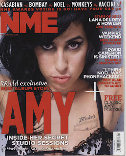
NME is a popular music magazine in the UK, the front cover of this particular edition is mainly focused on it celebrity model Amy Winehouse, this suggests that the issue may be highly focused around her as the picture of her is very large and uses a mid-close up. She uses direct address to connect with the readers, inviting them in to read. It only says 'AMY' without her surname anywhere on the front cover implies that the audience will be familiar with her instantly recognises who she is. The colour scheme is red and white, with some black from the main image. The colours are complementary rather than clashing reflecting how this is a more serious issue than usual magazines. It says 'World exclusive' above the main cover line showing a sort of exclusivity and this cover line draws the reader in to buy and read the magazine. The strapline at the top of the page shows some band names such as Kasabian and The Vaccines this attracts fans of these bands to the magazine.  It also makes it easy for readers to find it without even having to look at the contents by having the page number next to it. When it says 'have your say' makes it more personal to the readers and makes them feel involved. The cover lines help to summarise the most important features in the magazine and they are located near the top down the right side of the front cover. A lure is used in the cover lines to give the audience an insight into what it is they could be reading, this hopefully results in the magazine being purchased. There is also a 'FREE' sticker which is made clear, letting readers know that they if they buy that issue of the magazine they get free posters. The date of the issue and price is under the masthead in very small print. One of the first things usually people like to know is the price when they look to purchase magazines, so this may be difficult for them to see. The format of the magazine doesn't seem very formal, this colloquial style helps to  appeal to the target audience of  the magazine- young music fans.

3rd Draft of my Contents Page for my Music Magazine

This is the 3rd and potentially final draft of my contents page for my music magazine.I have made lots of changes throught the construction of this page and used the layout from my school magazine as a starting layout, it made it easier this way and helped me creat the final product.

2nd draft of the Contents Page for my Music Magazine

This is the second draft for my contents page for my music magazine. The layout is simple this makes it easy to reads which is key for the target audience, feel free to leave any comments below for improvements :)

2nd Draft of my Double Page Spread for my Music Magazine


This is the second draft of my music magazine double page spread I edited the main picture and changed the background to make it easier to read the writing, please feel free to leave and comments or suggestions forhow i can improive it :)

Friday 22 March 2013

1st Draft of my double page spread for my music magazine!


this is the first draft of my contents page its not finished yet, I need to add more for the text and edit it some more but ive kept in with the girly theme of the magazine in the colours and included an A4 picture of the main artist.

My first draft of my music magazine Contents Page!


This is the first draft of my music magazine's content page, is there anything I could improve on and what is it that you like? And what can I improve further?

Thursday 21 March 2013

Contents Page 1st Draft

 
This is my first draft, I need to add some pictures please comment on what you like and think I can improve on thank you!!!!
 

Wednesday 20 March 2013

2nd Draft of my Music Magazine Cover

2nd Draft:


This is the second drft of my music magazine cover, I changed the sticker of the '12 FREE POSTERS' to make it more like a music magazine and moved the coverlines any suggestions on how it can be improved further?

1st Draft of my Music Magazine Cover

1st Draft:
 
 
Here is the first draft of my music magazine, I still need to do some work on the editing and Ineed to arrange and add the coverlines still. 

Thursday 7 March 2013

Sketches of a double page spread

Sketches for a double page spread for my music magazine
 
 
1)


 2)


3)
 

Sketches of Contents pages

    Sketches of Contents pages for a music magazine

1)
                                             2)

Sketches of Front Covers

        Sketches of Mastheads for my music magazine!

1)   
 2)   


3)   


Monday 4 March 2013

Questionnaire for a Music Magazine!

Questionnaire for a Music Magazine!


QUESTIONNAIRE!

1. Would you read a music magazine?

                        Yes               No

2. How much would you be willing to pay for a magazine?

Free                   50p-£1.00                £1.00-£1.50                   £1.50-£2.00

3. Who should the magazine be aimed at?

11-12                 12-13                      13-14                       15+

4. What gender should the magazine be targeted towards?

        Males                               Females                           Both

5. What colour schemes would attract you as a reader?

Bright, clashing colours               Formal, plain and simple colours              Average, primary colours

6. What sort of front cover image would attract you to the magazine?

A popular artist                     A popular band                         Album covers                          Gig shots

7. Are there any other factors that you would like to see in the magazine?

(Please make suggestions as necessary)


Thank You!

TEXTUAL ANAZLYSIS ON A DOUBLE PAGE SPREAD!

              Textual Analysis of a Double Page Spread!


The main colour scheme of this page is pink, yellow, blue and white sigh pink being the most dominant colour to appeal to young girls. The blue don't on the left hand side of the page links both of the pages together due to the artist wearing the same colour for his suit. The blue of his suit and font may also resemble the artists masculinity. The artist is wearing a smart suit with sunglasses which is an unusual style but shows the uniqueness and edginess of the artist. The interview is set out in 11 separate areas with a subheading of the question the editor/ interviewer is asking the artist so that the reader can choose to read the answers to the ones they are most interested in. The whole right hand side of the page is taken up by a large images of the artist so that the reader can see who the article is about without even starting to read the article, however the writing to picture ratio is around 50:50. The pull quotes are used throughout the article to emphasise the important and interesting parts of the text so the reader is more likely to reader the whole of the article. The words 'exclusive interview' at the top of the page make the reader think that they haven't read anything like it before and that they will actually see what the artist is like because it is a personal interview with them. The smaller image of the artist and his mother helps to make the article very personal to the artist. The advertisement at the bottom of the page helps to promote the main artist even moe so that of the reading about the artist they can know when his new single is released and download it.

Thursday 28 February 2013

Colour Samples


Here are some potential colours for the magazine titel in a potential font:
 
CHART POPPERS CHART POPPERS

CHART POPPERS

CHART POPPERS

CHART POPPERS CHART POPPERS CHART POPPERS

CHART POPPERS

CHART POPPERS

My photos from my Music Magazine Photoshoot!


Here are some examples of the photos I took for the cover and inside my music magazine, I tried to use some of the shots and capture the essence of a typical music magazine in my photos.