Sunday, 17 February 2013

Student Magazine Cover

                                  My Student Magazine Cover! 


This is my final draft of my student magazine, I used a model who was a student so the cover is the relatable to the students it is aimed at. The model is using direct address which helps to grab the audiences attention. I think that a way in which the cover could be improved is by changing the colours of the cover lines to make them more readable however this was hard to do because the background was so busy and brightly coloured it was hard to find a colour for the cover lines which showed up and didn't clash too badly. Nevertheless, the cover does look believable as a real cover page as it includes all of the codes and conventions typical of a student magazine.

Thursday, 14 February 2013

Draft of my student magazine cover!

 
Here is my initial scan for the front cover for my Student magazine somethings I changed later on when it came to actually creating the cover but this is my original design.

Wednesday, 13 February 2013

FONT POLL!


Different Fonts:


Here are some possible fonts I am considering for my music magazine with a possible title. Please comment on which one you think is best:


1)

2)

3)

4)


5)
6)

7)

8)


9)

10)


(Please comment below on your favourite font you would like to see on the cover of a music magazine and which you feel best represents the pop genre of music)


Thank You!

Questionnaire for a School Magazine!

QUESTIONNAIRE!

1. Would you read a student magazine?
    
       Yes                          No

2. How much would you be willing to pay for a student magazine?

  Free        50p-£1.00      £1.00-£1.50            £1.50-£2.00

3. Who should the magazine be aimed at?

Recepion-Year 6    Year 7-8   Year 9-10   Year 11-13

4. What gender should the magazine be targeted towards?

 Males          Females        Both

5. What colour schemes would attract you as a reader?

Bright, clashing colours      Formal, plain and simple colours           Average, primary colours

6. What sort of front cover image would attract you to the magazine?

Students        Teachers      One Student       School Landscape

7. Are there any other factors that you would like to see in the magazine?

(Please make suggestions as necessary)


Thank You!

Tuesday, 12 February 2013

First attempt in Photoshop!


First Attempt in Photoshop

 This was my first time using photo shop EVER! I used it to practice for editing photos, skills which I will later use for constructing my music magazine. At first it was difficult but after practicing and learning how to use all the tools, I learnt skills which would be very useful later on.


I started with using the photo, and I used the lasso tool to cut out the crab and the lemon. Then I copied both images onto a new layer. I zoomed in to both images and tidied up the edges using the magic tool, I then used the free transform option to move the images to where I wanted them. I then used the colour fill tool to change the colour of the background to blue and I then changed the canvas size down the left hand side to make it look like a binder on a cookery book. I also added a light colour and edited the texture of the image. Finally I added text and gave it a contrasting colour which tied in with the lemons and brought the whole image together, this is my finished product:

Thursday, 31 January 2013

TEXTUAL ANALYSIS OF A COVER PAGE!

Textual Analysis of a Music Magazine 'TOP OF THE POPS'


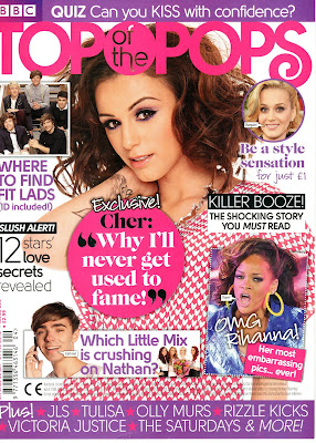
The title of this music magazine 'Top of the Pops' is right at the top of the cover page in large, bright pink font so the reader can see immediately the magazine brand when browsing for magazines to buy. the title straight away sends a clear message to the readers about the genre of music the magazine includes. The main colour scheme of  the magazine is pink and purple, the bright pink could be seen to represent the fun girliness of the magazine therefore clearly shows that it is aimed at young girls. The main large image of the artist is set in the centre of the magazine and takes up most of the page so the reader is directly attracted to it. The artist on the cover is standing with on arm down by her side and the other arm up by her face which looks like she is inviting the reader to come and read the magazine and her facial expression is directly looking at the reader (Direct Address). The artist is wearing pink clothes with white hearts which links directly into the girly, pink colour scheme of this magazine. Words on the cover such as 'EXCLUSIVE' make the magazine seem special and unique to the magazine market and by having exclusive interview with an artist like Cher Lloyd for example adds to this. Words such as 'SHOCKNG' make the reader more interested to but the magazine and find out what and why is shocking. The use of rhetorical questions are used to help to engage the readers intentions and make them purchase and read it to find out the answers to the questions. The quote 'Why I'll never get used to fame' is next to the main image of the artist to show the article is about her, the reader then becomes interested and therefore they want to read the magazine more. The examples of specific artists which are shown at the bottom of the cover page is for the reader so they can see if their favourite artist is included in the magazine, making the reader want to buy it to read about them. Finally, the bar code, price and issue number is located at the bottom left of the bottom page because it is the least important item on the page however not only is it a legal requirement but is also a typical code and convention of magazines.

Monday, 28 January 2013

Action Plan!!!

ACTION PLAN!!!

Dates:


11th-15th Feb
                 -  Layout designs
                 -  Font designs
                 -  Treatment Sheet

18th-22nd Feb
                 - Plan Photoshoot
                 - Take Photos
                 - Save selection
                 - Textual Analysis on 3 covers, 2 contents and 2 Double Page Spreads

25th-1st March
                 - Make Front Cover
                 - Post drafts
                 - Collect Audience Research

4th-8th March
                 - Make Contents Page
                 - Make Double Page Spread

11th-15th March
                 - Test Pages
                 - Start Evaluation